meetMED II, is an EU funded project, aims to contribute to enhancing energy security of beneficiary countries (namely Algeria, Egypt, Jordan Lebanon, Libya, Morocco, Palestine and Tunisia) while fostering their transition to low carbon economy, thereby contributing to more stable, efficient, competitive and climate-resilient socioeconomic contexts.
The logo
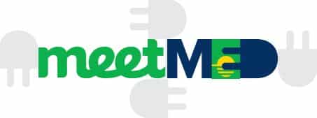
The meetMED logo aims to express the core aspects of the project, specifically the energy transition and the Mediterranean region in which the project takes place.
Click Here to Download The Visual Identity & The Logo Kit.
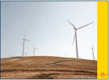
power cord >> electricity
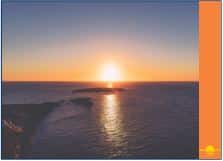
seascape >> mediterranean
sun >> energy
green >> nature


Exclusion zone
The ‘exclusion zone’ refers to the area around the logo which must remain free from other copy to ensure that the logo is not obscured. As the diagram indicates, the ‘exclusion zone’ is equal to that of the height of the logo.
Logo variations
Full color logo
The primary form of the logo is destined to be used against a white background only, and only in sizes large enough to maintain legibility (the logo cannot be smaller than 35mm wide).
Grayscale logo
The grayscale variation of the logo is destined to be used when the support doesn’t allow colours.
Monochrome logo
For use against a coloured or photographic background, it is mandatory to use one of the monochrome variations of the logo in order to hold enough contrast between the logo and its surroundings.
A monochrome variation is also to be used if the logo is smaller than 35mm wide.
Incorrect uses
The integrity of the meetMED logo should be respected at all times. Please do not stretch, condense, augment or distort its form. Changing any graphic element of the logo will weaken its impact and detract from the consistent image we seek to project.
Here are some examples of inappropriate uses of the logo.
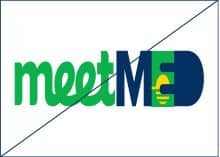
Proportions: do not change the proportions of the logos in any way.
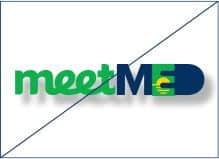
Effects: do not add any kind of effects to the logo.
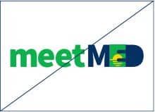
Typography: do not change the font used in the logo.
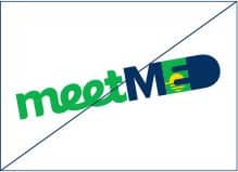
Angle: do not change the orientation of the logo by rotating it any way.
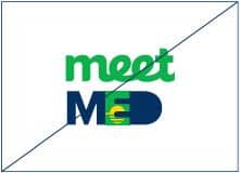
Layout: do not change the layout of the logo.
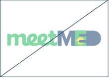
Opacity: do not use the logo at a reduced opacity
Colors: do not change any of the colors of the logo.
Resolution: do not use poor quality reproductions of the logo.
Primary colours
Green
print C80 M0 Y100 K0
screen R13 G167 B75
web #0db14b
Blue
print C90 M65 Y0 K55
screen R5 G48 B98
web #053062
Secondary colours
Yellow
print C0 M15 Y100 K0
screen R255 G212 B0
web #FFD400
Turquoise
print C100 M45 Y45 K0
screen R0 G118 B135
web #007687
Grey
print C0 M0 Y0 K10
screen R230 G230 B230
web #E6E6E6
Orange
print C0 M60 Y85 K0
screen R245 G131 B60
web #F5833C
Typography
Titles: Proxima Nova Extra Bold
abcdefghijklmnopqrstuvwxyz
1234567890!?*%%EDITORCONTENT%%amp;@%()
Subtitles: Proxima Nova Semibold
abcdefghijklmnopqrstuvwxyz
1234567890!?*%%EDITORCONTENT%%amp;@%()
Body: Proxima Nova Regular
ABCDEFGHIJKLMNOPQRSTUVWXYZ
abcdefghijklmnopqrstuvwxyz
1234567890!?*$&@%()
Graphic Elements
Seascape
The sunset graphic used in the meetMED logo can be used as a separate
branding element.*
In order to keep this element more discrete and not take the focus away from the content, use a lower contrast between the color of the graphic element and the color of its background.
Recommended color pairings:
GREEN + TURQUOISE
GREY + WHITE
BLUE + TURQUOISE
YELLOW + ORANGE
